

Table of Contents (6)↓
Walk through the landing pages of the top fifty modern technology companies launched in the past three years, and you will encounter an unmistakable sense of déjà vu. The same purple gradients, the same soft rounded pill badges, the same three-column feature cards with generic linear icons, and the same floating pseudo-dashboard mockups.
This homogeneous landscape did not arise by accident. It is the natural consequence of standardized UI component kits and template-driven design thinking. While component libraries accelerate initial scaffolding, they often strip products of character, narrative tension, and emotional resonance. Forward-thinking technology brands are rapidly pivoting away from this aesthetic complacency.
The Sea of Sameness in Tech Branding
When every competitor looks identical, brand recall plummets to near zero. A customer cannot distinguish between two B2B platforms if both present their value proposition in identical translucent glassmorphic containers. In competitive software categories, visual distinction is not mere aesthetic vanity—it is direct commercial strategy.
"Good editorial design treats content as the hero and the container as an invisible, disciplined stage. When typography has confidence, decorative gimmicks become obsolete."
What Defines Editorial Digital Design?
Editorial digital design borrows principles from high-end print publishing, modernist architecture, and Swiss typography, translating them into responsive, fluid web canvases. Rather than packaging every idea into a box, editorial design utilizes proportion, contrast, and negative space to establish reading rhythm.
Hierarchy and Rhythm Over Synthetic Decoration
Oversized display typography paired with disciplined body proportions commands immediate focus. Instead of adding background glows, drop shadows, or floating 3D spheres to generate interest, editorial layouts allow the stark contrast between light and dark, large and small, dense and sparse to do the heavy lifting.
Asymmetrical Composition with Purpose
Symmetry is comfortable, but asymmetry sparks intrigue and guides the reader's eye sequentially. Off-center headings with intentional typographic indentations—such as displacing titles by sixty to eighty pixels against their container—create editorial tension that keeps visitors scrolling and absorbing narrative information.

The Quantifiable Business Impact of Visual Differentiation
Our client implementations demonstrate consistent metrics following an editorial redesign:
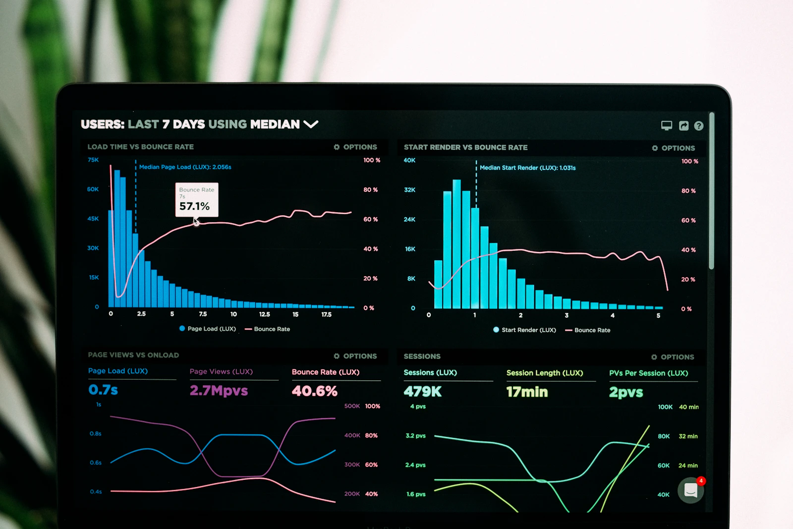
- Increased Session Duration: Time on page increases by 35% on average as readers engage with narrative typography rather than skimming generic cards.
- Higher Inbound Lead Quality: Premium editorial positioning signals institutional credibility, attracting enterprise-tier decision makers over low-budget commoditized shoppers.
- Accelerated Brand Recall: Prospective buyers consistently recall distinct editorial websites during vendor selection bake-offs.
Engineering Editorial Design on the Modern Web
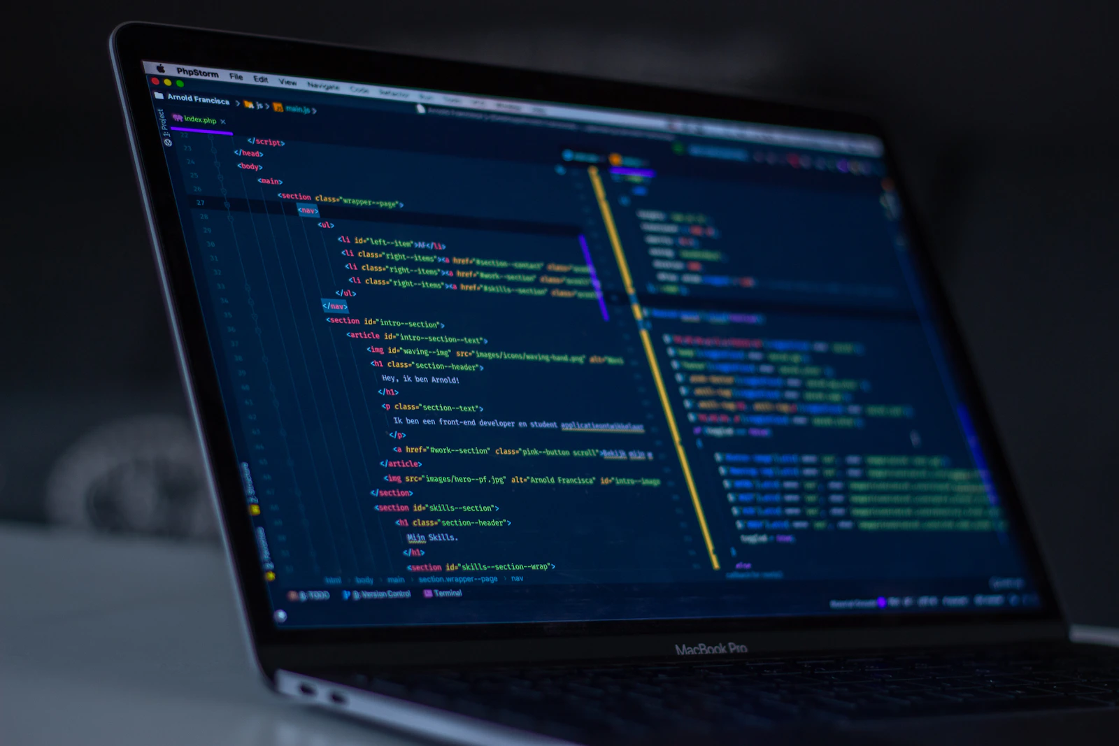
Building editorial layouts requires modern CSS capabilities that were previously cumbersome to orchestrate. Modern CSS Grid, subgrid, container queries, and clamp-based fluid typography enable responsive fluidity without compromising rigid alignment rules:
/* Fluid editorial typography scale with clamp */
.editorial-headline {
  font-size: clamp(2rem, 1.2rem + 3.5vw, 5.5rem);
  line-height: 0.95;
  letter-spacing: -0.04em;
  text-indent: clamp(0rem, -2rem + 6vw, 8rem);
}
By embracing editorial conviction, brands elevate their digital presence from another forgettable commodity into an authoritative cultural voice.

Yogendra Singh Chouhan
Senior DeveloperCrafts cohesive design tokens, accessible component hierarchies, interactive prototypes, and typography-led layouts that scale.